The presentation today was lovely, it was really nice to hear everyone's journeys throughout the project. Unfortunately I feel I could have done a lot better. I'm not sure if it was because I have such an emotional connection to the work but it certainly gave me plenty of food for thought and highlighted skills and areas I need to work on.
When I was first put into TD4F I was really nervous about it, I was worried my work wouldn't suit this pathway. I quickly realised this area was an excellent place to start my journey on the course and the brief would give me a good foundation for my future practice. Julie Haslam is an amazing tutor and has given us so much support and guidance sharing her extensive knowledge and experience in this textile world. The main things I will take with me is to plan and organise my time more efficiently, draw, draw and research even more. Most of all enjoy what I am doing and approach every challenge as an opportunity to learn. Well done to all the lovely girls I have had such a pleasure working with and alongside.
Tuesday, 20 November 2012
Design boards
 |
| Customer profile board: Urban Girl about town, likes to party and dance, likes the fun things in life, loves her music and is a little bit street in her attitude |
 |
| Colour board |
 |
| Mood board; Nostalgia, innocent fun, sweet moments of simple pleasure |
 |
| Design board |
 |
| Design board |
Editing and selecting final designs
Final designs |
| placement design for vest |
 |
| repeat pattern for leggings |
 |
| repeat pattern for playsuit |
 |
| Placement design for jumper dress |
 |
| repeat pattern for Skirt |
 |
| placement design for T-shirt |
 |
| repeat pattern for use as an accent, maybe I will use as a trim on one of the placement designs |
IT was only when I printed out some of my designs that I could see which were working within my concept and the overall collection as a whole. I was surprised by my end selection as it was not what I thought I was going to pick. This shows the importance of seeing your designs together in order to produce a coherent collection that works together. Also the designs and colours can look completely different within the constraints of a computer screen.
Photoshop continued/ introducing new elements
 |
| silhouette drawings of Jack and Ruby |
I began to introduce more elements into the designs, different silhouettes, brusho work and using the bubbles in different ways. Some worked well and some not so good. It was all learning to me and I really enjoyed this part of the project. This was probably a downfall, as I was enjoying it so much I spent a little too much time on this part leaving me little time for the rest of the project. However it has taught me to plan my time more effectively next time.
 |
| I feel the 3 silhouette drawings I made really work well together in this pattern |
|
| using similar processes as the earlier bubble designs I used another silhouette of Jack when he was little dressed in his Buzz lightyear costume, only this time I isolated the single silhouette as a placement idea, I tried different colours and drawings but felt this worked best as it added the bright, fun pop of colour the collection needed. |
|
| This piece was created by making a repeat pattern from one of the photographed bubbles and layering it over a piece of Brusho ink work |


Graffiti bubble Ben / Digital prints
Using the photographs I took of the bubbles in front of my graffiti piece, I cut out individual bubbles and used them to fill one of my silhouettes. This took rather a long time, maybe I should have just used a few bubbles , resizing them to get the same effect.

 |
| I used a single bubble to create the background in this piece |
 |
| experimenting with Photoshop tools |


 |
| This idea was used to create the repeat pattern below which I went on to use as a background |


 |
| I liked this design but felt it was too bold for my collection |


Colour palette
My colour palette came from looking at bubbles, rainbows and puddles on a rainy day. I wanted the colours to be fun and happy, also to convey the emotion in my concept. 

Monday, 19 November 2012
Graffiti bubbles


I made this graffiti piece to take photos of bubbles in front of. It was my first attempt using spray paints and found it a lot trickier than it looked. Trying to get good pics of moving bubbles wasn't easy either, especially as I had no willing volunteers so had to blow the bubbles and take the pictures at the same time. I took about two hundred and fifty photographs in total. the plan waste use the bubbles with the graffiti showing through, to fill a silhouette of ben in photoshop.
Brusho bubbles
Theese Brusho experiments were approached is a more controlled way and were inspired by bubbles I really like them how they are and have decided to use them as a placement print. They also play a big part in my colour palette


I tried the bubbles on loads of different backgrounds, and played around with them in photoshop but in the end I decided I liked them just how they where and when I was selecting I felt the white background worked best alongside the other designs.


Thursday, 15 November 2012
Design Elements and illustrations
| I really like this sketch I did of Ben and plan to use has an element in my designs, the tears from the eye will be the water he is splashing in. This drawing really represents my concept as it is meant to symbolise how even when you are heart broken you can still find a memory that makes you feel happy. Without sadness and heartbreak can we really appreciate love happiness. |

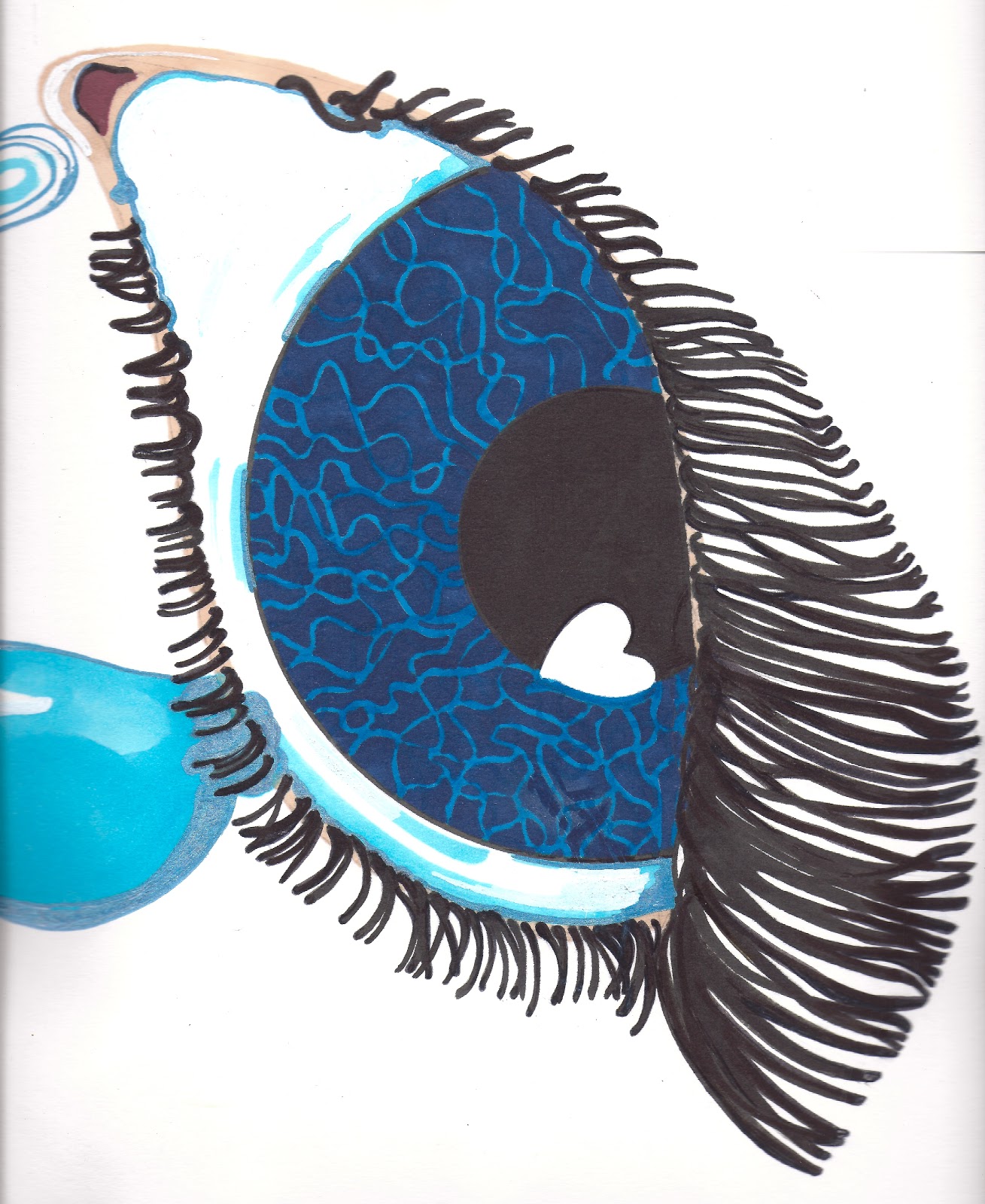
I drew this piece by hand but when I scanned it in to photoshop it took literally ages to clean up around the lashes as I wanted it to be perfect, I think it may have been easier to draw the lashes on in photoshop or illustrator but not sure if it would have the same feel. This is something for me to experiment with in future.
 |
| Textured card used to stamp ink onto paper to use as tears |
|
| Once I had scanned all the seperate elements in I played around with it in Photoshop and came up with this final placement design. I can see this on a slouchy jumper dress, with the eye on the shoulder or maybe a hood, the tears falling all the way down the dress with Ben at the bottom splashing in the puddle. This design is my favourite piece so far as it is really personal and through all my sadness for the loss of my little brave star Ben it celebrates his always happy spirit. |

I made this illustration of Rita Ora, my muse for the project, using dots instead of line. To get a variety of marks I just used different sizes of drawing pen, I was quite pleased with the result as I am not usually good at getting the facial proportion right and this technique is a simple way of giving texture or shading.
Subscribe to:
Comments (Atom)