Tuesday, 20 November 2012

Colour palette

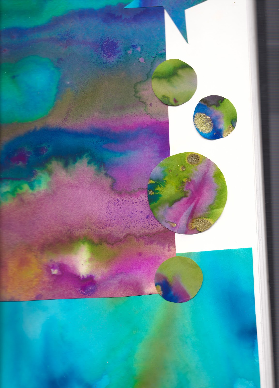
My colour palette came from looking at bubbles, rainbows and puddles on a rainy day. I wanted the colours to be fun and happy, also to convey the emotion in my concept. 

Monday, 19 November 2012

Graffiti bubbles


I made this graffiti piece to take photos of bubbles in front of. It was my first attempt using spray paints and found it a lot trickier than it looked. Trying to get good pics of moving bubbles wasn't easy either, especially as I had no willing volunteers so had to blow the bubbles and take the pictures at the same time. I took about two hundred and fifty photographs in total. the plan waste use the bubbles with the graffiti showing through, to fill a silhouette of ben in photoshop.

Brusho bubbles

Theese Brusho experiments were approached is a more controlled way and were inspired by bubbles I really like them how they are and have decided to use them as a placement print. They also play a big part in my colour palette


I tried the bubbles on loads of different backgrounds, and played around with them in photoshop but in the end I decided I liked them just how they where and when I was selecting I felt the white background worked best alongside the other designs.


Thursday, 15 November 2012

Design Elements and illustrations

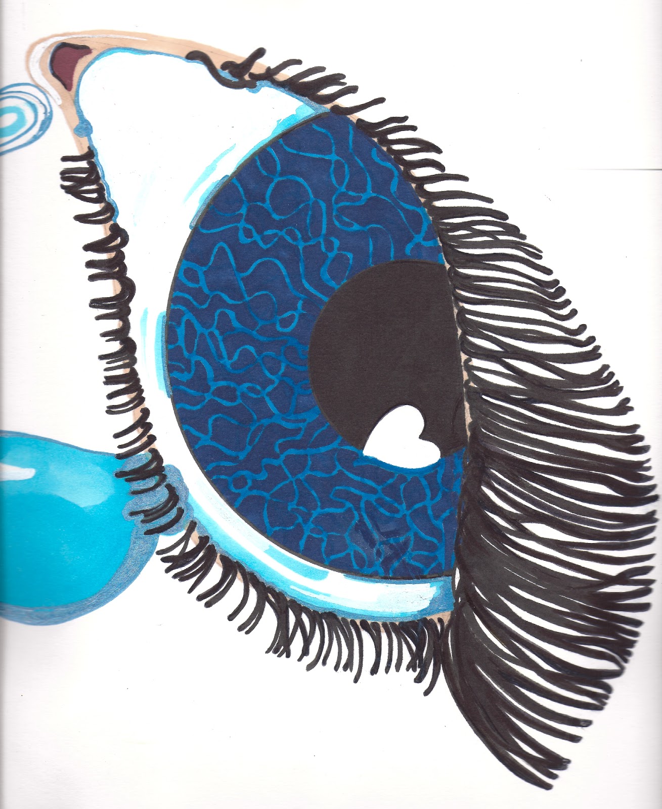
I really like this sketch I did of Ben and plan to use has an element in my designs, the tears from the eye will be the water he is splashing in. This drawing really represents my concept as it is meant to symbolise how even when you are heart broken you can still find a memory that makes you feel happy. Without sadness and heartbreak can we really appreciate love happiness.


I drew this piece by hand but when I scanned it in to photoshop it took literally ages to clean up around the lashes as I wanted it to be perfect, I think it may have been easier to draw the lashes on in photoshop or illustrator but not sure if it would have the same feel. This is something for me to experiment with in future.

Textured card used to stamp ink onto paper to use as tears

Once I had scanned all the seperate elements in I played around with it in Photoshop and came up with this final placement design. I can see this on a slouchy jumper dress, with the eye on the shoulder or maybe a hood, the tears falling all the way down the dress with Ben at the bottom splashing in the puddle. This design is my favourite piece so far as it is really personal and through all my sadness for the loss of my little brave star Ben it celebrates his always happy spirit.


I made this illustration of Rita Ora, my muse for the project, using dots instead of line. To get a variety of marks I just used different sizes of drawing pen, I was quite pleased with the result as I am not usually good at getting the facial proportion right and this technique is a simple way of giving texture or shading. 

Research

Another subject that brightens my walk home every day is the graffiti around Manchester. I began to look at graffiti artists and came across 'moss grafitti'. I really love it and plan to give it a go as soon as I find a wall I can use!

Creating Flats in illustrator

The workshop learnt us how to trace a technical drawing in illustrator, so that it looks professional on designs. The programme takes a lot of getting used to. Although I have used photoshop, illustrator is a lot different. the main difference being that Photoshop uses pixels, were as Illustrator uses paths and vectors. It can be quite frustrating at first but the end result is well worth it.


shirt drawn in illustrator   

technical drawing workshop

The workshop on how to draw garments to scale was really good but when doing it for the first time, it was a long frustrating process. The end result was worth it and I am sure that the more you do the easier and quicker it will get. The main thing I learnt was to spend time making sure you garment is flat , straight and evenly placed. We got loads of tips like fixing a plumb line to start with so the it is easier to find the centre for each measurement.

Silhouettes


Inspired by the final cut exhibition and my sketches of the children playing coupled with the lovely photographs I have been looking at. I wanted a simple way to convey a memory of a captured moment of pleasure. I decided to pick out silhouettes the evoked a sense of childhood innocence freedom to play. I used the ink work I had done and selected areas to cut from. I love how taking away the detail makes the image simple but still apparent, whilst the movement and variety of marks in the ink still gives it depth that you wouldn't get in a monotone silhouette.


Final Cut Exhibition

Sue Blackwell

Rob Ryan
Add caption

Claire Brewster

I was really excited to see the final cut exhibition and it didn't disappoint, alongside some of my favourte artists who I have favourite who've I have shown above, there was a diverse range of work all made from paper, gorgeous! There was a wide range of techniques on show of contrasting scale which was inspiring to the possibilities of a medium often taken for granted.

Brusho experiments


The Brusho pieces were inspired by, bubbles, rainbows, rainy puddles and memories of Ben playing and enjoying the simple pleasures of life. I tried to work expressively and instinctively attempting to capture a mood or emotional connection to my concept.
I used a lot of water, creating pools for the ink to settle, hoping to capture movement in the work. Already I can see a colour palette forming. 


TD4F Concept


On my walk home from university, I was feeling empty, consumed with heartache, longing for a hug from my Benny Baby. As the sun began it's journey to the other side of the earth a dramatic low light was cast upon my world. Suddenly everywhere I looked I saw a vivid splash of green, little balls of moss adorning every surface possible. Bursting through the pavement and sprawling over walls. I was instantly transported to a happier place, smiling with thoughts of Ben and how he had that effect on people, he could make anyone smile. His nature was simple and loving and and when he suffered more than I can ever imagine he still managed to smile, never ever complaining. My concept was realised, simple moments of pleasure that prevail over the darkest of days. Like Ben the most beautiful of things are often the ones that are gone too soon. like Rainbows on a rainy day, shooting stars that travel the galaxy just to be seen for a moment or bubbles, little orbs of wonder ready to burst at any moment.

Monday, 1 October 2012

Liverpool Biennial Visit


This year the Liverpool Biennial, a ten week Contemporary art event, presents works by 242 artists across 27 locations. The central theme ‘The Unexpected Guest’ explores the notions of hospitality.

Having sadly missed the trip to Liverpool with my peers, I finally made it to my home City Saturday afternoon. After an interesting train journey from Deansgate to Lime street, I made my way over to FACT on Wood street. Passing one of my old haunts on the way, a little Chinese bakery, I couldn’t resist popping in for a Charsui bun. Just one bite and I was flooded with memories of my time at Liverpool college and lunchtimes spent eating them in the old bombed out church at the bottom of Hardman street, people watching and reflecting on my day so far. It got me thinking about why I would make that extra journey rather than join everyone else in the pub just around the corner, where the food was pretty drab. Why are we prepared to go the extra mile for a little bit of momentary pleasure.

Arriving at Fact I was met by the sound of children enjoying the interactive part of the exhibit and it got me thinking about communal art projects, shared experiences and shared journeys. Why do most of us prefer to make a journey in a group. It has never bothered myself going to events and places alone but there are lots of people I know of that would never go alone to a concert or on holiday. I myself quite enjoy making journeys alone without the worry of accommodating other people, allowing me to discover at my own pace, without the distraction of feeling the need to chat all the time. Its not a preference but sometimes its nice.

Heading towards the gallery spaces I was immediately drawn to the huge curtain of psychedelic pattern adorning the stairway and walls in the foyer. Made from strips of fabric wove onto at least a hundred Hoola hoops ( I regret not counting them) it had a simplistic naivety, that I found really interesting and fun. Although each hoop was originally of the same shape and size they where transformed to individual form by the addition of the fabric and how they where arranged. Some keeping their perfectly circular shape and some being pulled in numerous directions by the weight of the overall structure, they were transformed  into something unpredictable. It reminded me of people and how we shape each others lives through our interactions and shared experiences. The diversity of modern day society and how we can join together to create something wonderful whilst still retaining a sense of individuality.

I started a journey of exploring the piece from every angle , because it wrapped around the internal space on three sides it gave extra dimensions to how it looked as a whole depending on where you viewed it from. The windows opposite the central section flooded it with light and I thought about how the weather or the time of day may affect its impact. I quickly decided that my favourite viewpoint of the installation was from beneath the stairway looking through one side , through which the opposite side of the piece was still visible. This gave further dimension to the piece incorporating layers of light and shadow. This gave me lots to consider in my own approach to both scale and how my work is displayed. In future I will give a lot more consideration to the enviroment in which a piece of work is intended to be displayed or used and the impact of its surrounding, or how elements such as light affect how a piece is viewed.

More food for thought came from the discovery that the piece was created as part of a collaborative project with the Liverpool community and the artist Jemima Wyman. The project title collective coverings, communal skin turns garments used for violence, such as camouflage t-shirts, transforming them into objects of comfort. Investigating the ideological history of fabric and the use of recessional materials. The artists intention of using the the canopy as a second skin to the hard industrial architecture of the building, creating an interior structure which is soft and organic was in my opinion successfully realized. 

                                     Jemima Wyman 

                                 Collective Coverings, Communal Skin

The Gallerys lighting seemed to almost interact and become part of the exhibit

View from beneath the stairway
Instructional video of the weaving process

Thursday, 20 September 2012

Origami Kite

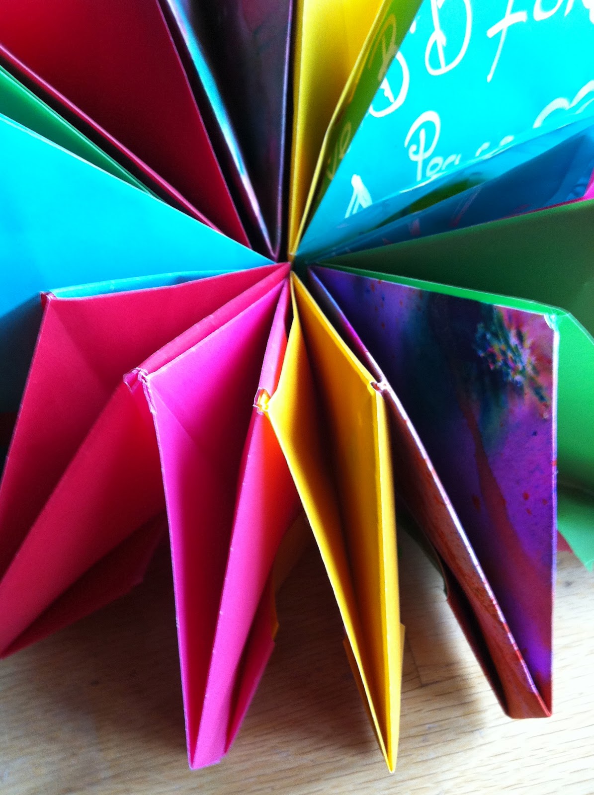
This kite is a moving piece of Origami, it changes shape as it turns outwards from the centre, creating different patterns on it journey. It reminds me of the kaleidoscope toys I played with as a child. It was made from 12 folded squares of paper, all equal in size. Each section is slotted into the next and then the last attached to the first before further folds are made. There was no need to use any glue or tape . I used 10 pieces of semi transparent waxed paper, 2 of which I added text. The other 2 pieces where cut from abstract ink work on heavy cartridge paper. The inspiration for the Kite came from thinking about my aspirations for the future and the dramatic and exciting changes I am making in my life.


                                                    Firework Kite; Paper, Ink, Chalk Pen

Tuesday, 18 October 2011

Sunday, 16 October 2011

Digital Images

Translating Taxidermy
Final Project Foundation year


The design for the wallpaper, silk headscarves and drape came from drawings I made of the bird collection , housed in drawers at the Liverpool museum. The collection was also my main source of reference for the mummified feet, tags and colour pallette.
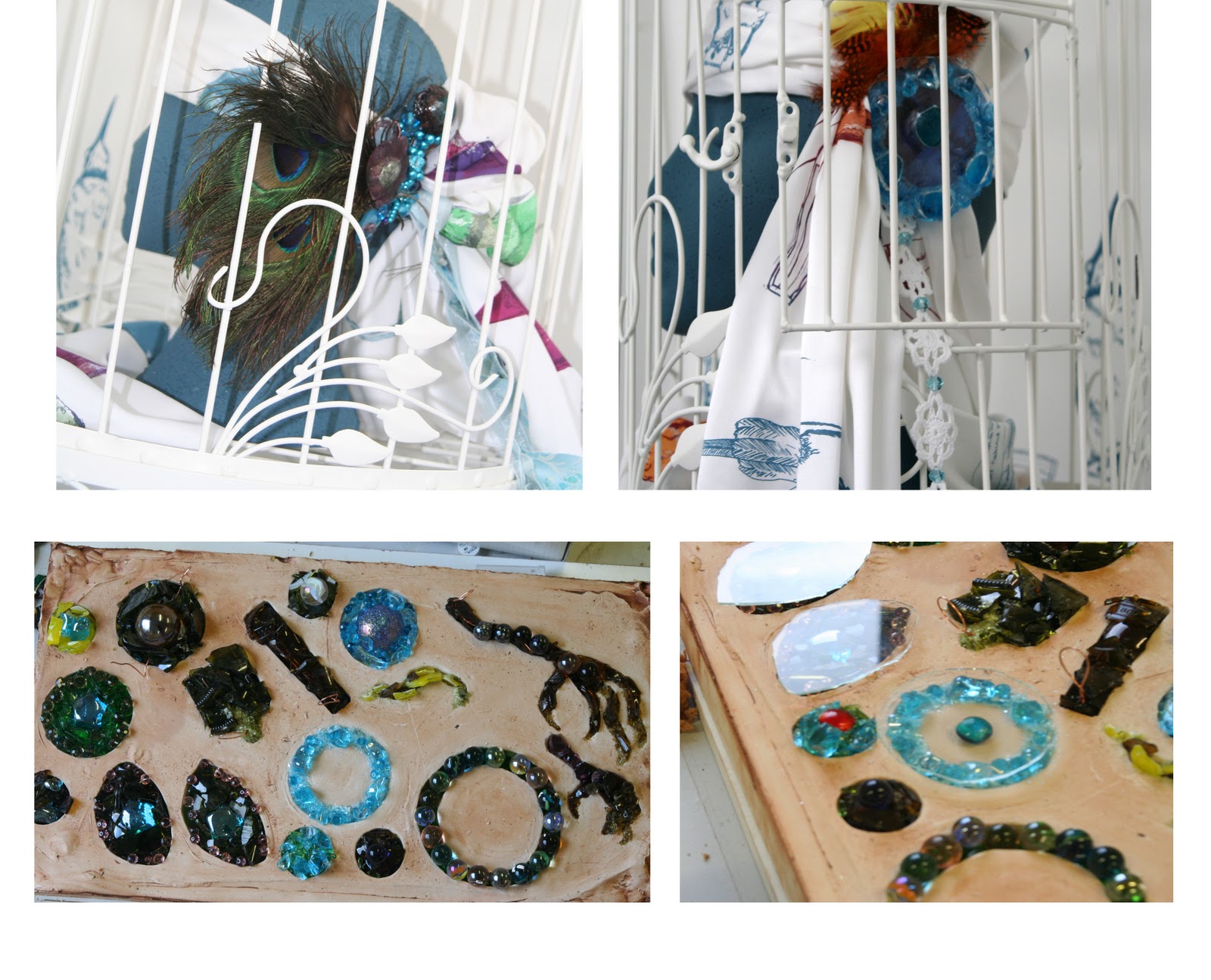
Birds Feet pendants; fused Glass, Copper wire, wool, wax, P.V.A, Embroidery thread,  
Tags; Fabric, Tea, Coffee, Dye, Bleach, Soldering Iron, Ink
Digital imagery was developed by layering photographs, drawings, inkwork and text in photoshop. The final designs were printed onto heat transfer paper , specific areas of the designs were selected and pressed onto silk and various found vintage fabrics.

Friday, 14 October 2011

 GLASS EXPERIMENTATION
                                                                                                                                                                                        Influenced by my studies of birds eyes and the use of glass eyes in taxidermy, my experimentation in slumping and fusing glass was developed towards creating wearable pieces that would translate my response  in the subject.  


11056634

Translating Taxidermy
Final Project Foundation year